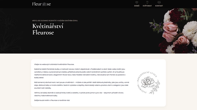
WordPress Landing Page
The site is lightweight and focused — one main page with quick access to photos, contact info, and seasonal offers. No heavy plugins, no extra clutter. Just something that loads fast and looks good on mobile.
We used warm, soft colors and rounded shapes to keep it feeling friendly. It’s not corporate — it’s handmade, local, and warm, like the shop itself.
Branding & Visual Style
Fleurose didn’t have any consistent look before this.
So we built a small brand system around their name — a logo, fonts, and a few accent colors that can be reused on everything from social posts to packaging.
It’s simple but fits perfectly with what they sell.
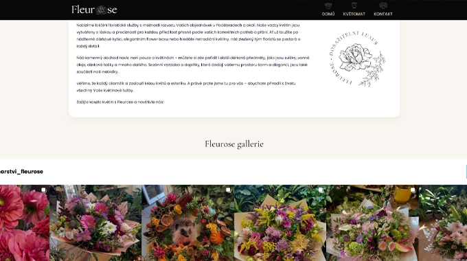
Social Media Work
Once the visuals were ready, we set up Instagram and Facebook ads using the same design language.
We made short posts, promo stories, and some image templates they can reuse later.
After the launch, engagement started growing right away — people recognized the name and the colors almost instantly.
Result
Now Fleurose finally has a proper online identity. The landing page runs smoothly, the visuals are consistent, and the brand feels complete — from the logo to the posts customers see in their feeds. It’s a small business, but the new look makes it feel professional and local at the same time.